For my final project, I was thinking of doing another podcast. I really enjoyed creating the first one and I feel as if I could create a successful series. I will create a subdomain on my site which will house the series. I plan to create a new series, as opposed to continuing my previous podcast. The new podcast series will be about the show ‘Gilmore Girls.’ I feel that I could easily create at least three episodes critiquing the show.
I would like to build out my main domain with projects I have worked on. I want to include projects from this DGST course, like the video and podcast projects. I also have podcast projects from my drug politics course that are much longer. Furthermore, I would also like to share some of the research papers I have written, particularly the ones from this semester’s politics of the Middle East and North Africa course regarding sports washing in Saudi Arabia and the Gulf nation’s responses to the Arab Spring. I envision the built out site retaining much of the same design that my current one has but with better organization for things like blog posts, podcasts, and research essays.
It is so CRAZY that we’re already talking final projects??? How is it already time for this?
I Hate to Be Basic
So I hate to be basic, but I am definitely doing what Professor Berge said most people do for their final project…kinda.
I feel as though most of the hobbies and passions I have are SO unrelated to each other, so when I show and tell people about each of them and the work I do within their spheres, they’re all separate. SO, I want to create a subdomain where all of my creative works can live and coexist in one space together, organized respectively and packaged with a bow:)
This will include all of my experience in both of my career field interests, both historic preservation and communications, fitness and wellness accomplishments and clients, and any creative works including but not limited to content creation, photography, and modeling. To include all of these, there will be images, links, and blog posts included in this subdomain. This subdomain will be created keeping in mind that it will be a link on my resume, so all works will be included will be works I’d be okay with possible employers seeing (lol).
I want to build a new subdomain fr my final project. I have two options:
I would like to create a field hockey tutorial website, where I post videos of my teammates and me demonstrating field hockey skills to teach others.
I would like to continue my Dancing with the Stars reaction videos to other dances, potentially other seasons.
I feel like option one is very interesting to me, but option two would provide more entertainment to anyone who wants to view. Either idea will be a new subdomain, and have the same format, just different videos will be filmed.
Overall, the data shows that depression rate is pretty consistent across races. On average, individuals of ‘other’ ethnicities and races have higher rates of depression. White individuals have on average, the second highest depression rates, followed by black, hispanic, and then asian/ pacific islanders. Another interesting find is that there was, on average, a slight increase in depression rates across all races in 2017. Oppositely 2012 had the lowest average depression rates across all races. As a psychology major, it is not uncommon to learn about the unequal availability of treatment. I feel that maybe the discrepancy between races could potentially be attributed to that. Because white individuals are of the majority, they have more access and better treatment than those of a minority group, thus possibly accounting for the much higher diagnoses.
Why I chose this Media & How it Supports the Story in the Data
I chose this infographic because I like that it allows you to see how the races stack up together within the same year. I find the discrepancy between races so interesting and I feel that this infographic allows my readers to interact with each data point individually. In doing so, they are more able to get a sense of how depression rates stay consistent per race over time, but how the individual races vary. I think that being able to see each year in its own section, really shows how big of a difference there is in diagnoses of depression across race.
Process
I honestly really struggled creating this media. Getting a hang of Storyline was the most difficult. Figuring out how exactly my data would be presented and what I wanted shown were the first step in the process. Once I figured that out, I played around with Storyline to show my data in the best way possible. The worst part of the process was getting it embedded to this post. For some reason, I struggled tremendously and could not get it to embed, which I think is because Storyline is not an accepted platform for embedding on WordPress.
Obviously obesity is a major health risk and is increasingly a talking point in the medical and public health fields. However, visually displaying the data can make the problem more easily understood. I chose to display the data in a map, where higher rates obesity are represented by darker coloration within the corresponding states borders. When displayed like this on a map of the United States, it jumps out to viewers that the Southern United States is far more obese than other regions. Particularly, the Gulf states of Alabama, Mississippi, and Louisiana are the most obese in the nation. The data was compiled by Lake County, Illinois but was found on Data.gov. The information primer on obesity was courtesy of the World Health Organization.
How I did it?
I chose to create a map, with higher rates of obesity being colored darker on the map. I feel that this represents the story I was trying to tell, which was that Southern states have a higher rate of obesity, better than a simple bar graph. Although, I did include the bar graph, which was made with Microsoft Excel, within the PowerPoint presentation to give viewers further numerical information. The map of the US was made via Flourish, a data visualization software. I wanted to make a short PowerPoint presentation because it would convey a short primer of what obesity is, with a short analysis of the map and bar graph. I chose to use PowerPoint because I am familiar with the software and it allowed me to create a simple presentation to convey the story using the data I found. I ran into a challenge embedding a PowerPoint presentation, but managed to get into embedded by downloading a plugin EmbedPress, which allowed me to upload a document to my blog post.
While looking through the grades that were earned for the Spring semester of 2024 and the number of students that are enrolled in the different departments I noticed that Business has the largest enrollment of students. However, they do not have the hightest average grade point average. What also needs to be evaluated though is the fact that the CLPR department has a substancially lower nubmer of students than the Business Department. This causes the data to be greatly different and possibly ineffective.
I got the data of education, unemployment, poverty and population from data.org. I downloaded the data in an excel format. The data covers all the States including Puerto Rico. The data for education, unemployment and population have time series.
Cleaning the Data
I wanted to focus on Virginia so I deleted the data for the States that are not needed. I also deleted other columns such that have values and not rates. This is because due to difference in for example size, economic activities, etc., I wanted to focus on rates which may be comparable. I used the Microsoft Excel software to clean the data format the table and to do the pivot table.
Formatting the Data as Table
In order to prepare the data to be used for the pivot table, I have to summarize the time series by finding and using the averages. I used data on average percent of adults with less than high school diploma, average unemployment rate, average household median income as percentage of State median household income and poverty rate for 132 counties and cities in Virginia. I have to take out Clifton Forge City and Bedford City because they do not have values for the variables above with the exception of education.
Pivot Table
I did the pivot table based on the counties and cities data on average percent of adults with less than high school diploma, average unemployment rate, average household median income as percentage of State median household income and poverty rate. I used the pivot table to find the average , minimum value and maximum value for the variable. For education Buchanan County has about 52% of adults with less than high school diploma from the estimated average with data from 1970 to 2022. Falls Church City has a minimum percent (9.5%) of adults with less than high school diploma. Attached is the excel document with the data for the pivot table, and the data for the pivot chart.
Education may have some effect on unemployment, household income and poverty. The pivot table shows that Buchanan County with the percent of adults without high school diploma has an unemployment rate higher than than Virginia unemployment rate, a median household income that is about half of the Virginia average and a poverty rate which is about 10% higher than Virginia average.
Image
This is the image chart trend of the percentage of adults with less than high school diploma in the US, Virginia, Buchanan County and Falls Church City from 1970 to 2022.
Listing the specific trends displayed within the data charts listed above
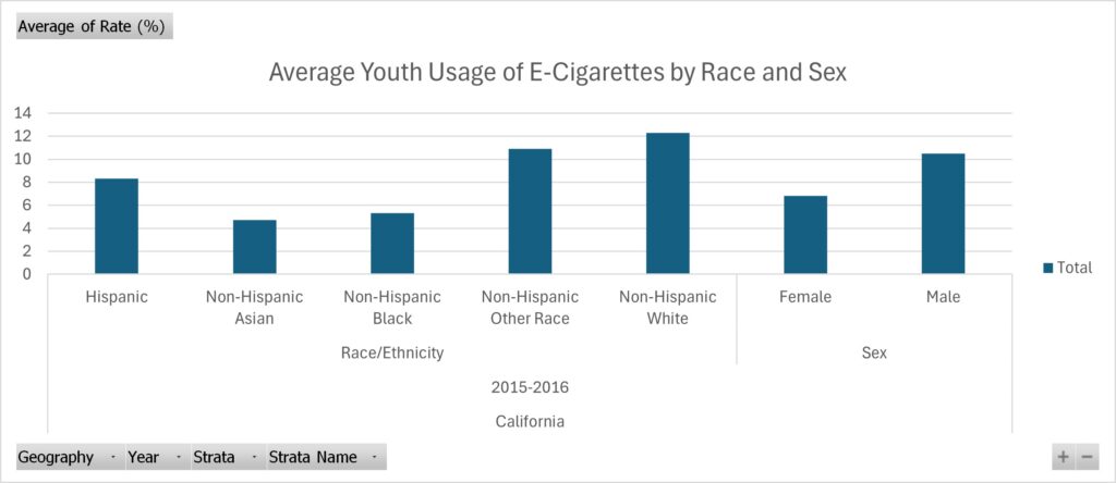
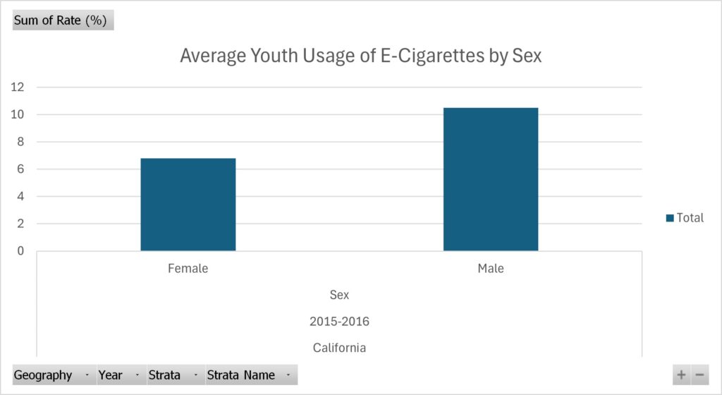
For the data I collected, I chose to inspect trends within the usage of e-cigarettes for the youth. I originally hoped to find some recent research on this done in Virginia. However, I found research done in California instead, and the most recent study I could find was done in 2015/2016. However, I think this is a great state to look at these trends in – since it’s a large state that usually sets many societal trends, including using e-cigarettes. Within the data I collected, I found a trend of white males being the most common perpetrators of e-cigarette usage. I found this data to be extremely interesting, as it defies stereotypes that usually individuals of color are the ones partaking in activities like using e-cigarettes.
The Process for Finding These Trends
The steps I took to find these specific trends within the data
I found this specific set of data on Data.gov! After a lot of research (and figuring out what story I wish to portray) I found this set of data that really pushed the story I wanted to convey – being that the use of what seems like deviant acts (such as using e-cigarettes) isn’t only by individuals of color, thus another reason why we need to steer clear from this stereotype without doing the proper research. After finding this data, I made use of the cleaning process by watching professor Berge’s video in Canvas. I removed the column that displayed the grand total of individuals that partook in the study, as well as the lower and upper 95% confidence interval because it was irrelevant information to the point I was trying to make. Therefore, once I finished cleaning the data, I isolated the different trends I wanted to highlight in their own pivot tables: one for the sex and the other for the ethnicity of youth that partakes in using e-cigarettes. I did all of this using Microsoft Excel.
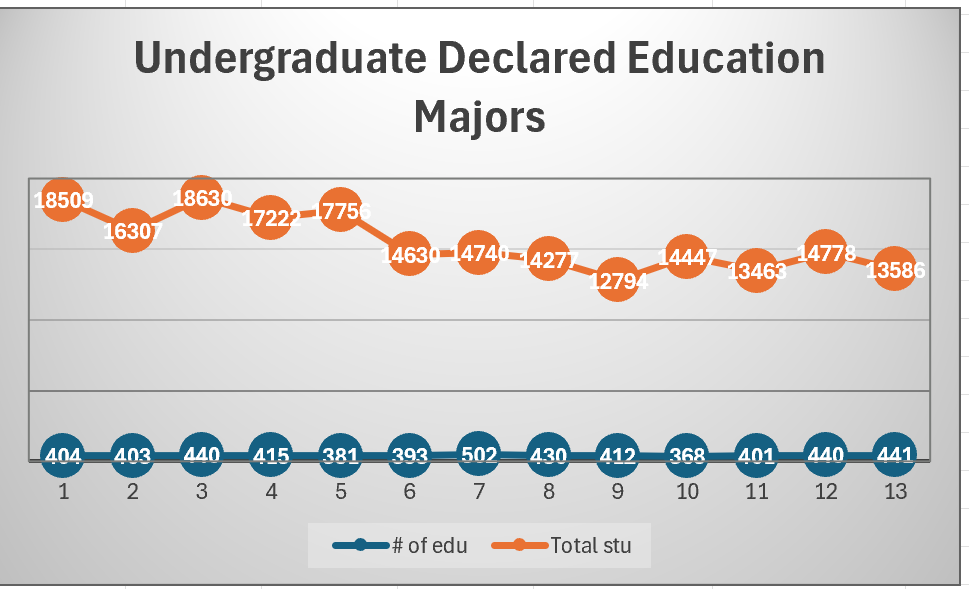
For the data trend project, I decided to examine the number of declared education majors at UMW compared to the whole student body. The United States is going through a teachers crisis, and I was hoping that examining the number of students majoring in education might explain a trend that mirrors the number of current teachers in the US to try to identify what is causing the shortage in teachers in America today. Examining the data through the table and chart revealed that while the number of students at UMW studying education remained relatively low, the number of education majors remained steady even increased after COVID, though decreased in the the most recent years. I found this data set through the UMW Grade Distribution Report. The full data set can be found through this Excel Sheet.
Process
The trend of the number of declared education majors at UMW decreasing and then steadily increasing overtime was found through Excel. After looking at the Grade Distribution Report, I copied the number of total declared education majors for each semester onto an Excel sheet (excluding Spring 2020, which did not have any data due to the change in grading systems as a result of the COVID outbreak. After creating a table, I copied the data into a pivot table, which helped me create a more visual line graph to represent the changes in the number of declared education majors and total undergraduate students with declared majors. Through the chart, I was able to identify that the data first decreased, increased, and then decreased overtime. The steady decrease in the years after COVID may represent a possible trend in teaching conditions after COVID, though the data resembled pre-COVID data closely.