
For my final project, I would like to expand my main domain and include some of the work that best reflects my online identity and career aspirations. I would like to include my video and storytelling assignments, in addition to an infographic I made for another class. I would also like to include a few research papers from some of my psychology classes. The common themes for the included work will be literacy and community advocacy. Specifically, advocacy for women and underserved populations. Literacy and advocacy are two areas that I’ve been interested in since before college and areas that I have done a lot of volunteer work with. Also, I would like to find an internship in social services this summer and am considering a career in school counseling. I feel that the work that I plan to include will be a good representation of who I am to future employers.
Video Checkpoint
Shot List
| Done | Scene | Shot | Location | Shot Type | Scene Description | Camera Movement | Notes |
| FALSE | 1 | Graphic | Title Card | Make in Canva | |||
| FALSE | 2 | A | Kitchen | WS | Introduce Episode | Tripod | |
| FALSE | 3 | A | Kitchen | MS | Explain Ingredients | Tripod | |
| FALSE | 3 | B | Kitchen | CU | Show Ingredients | Pan across ingredients | |
| FALSE | 4 | A | Kitchen | MS | Explain equipment | Tripod | |
| FALSE | 4 | B | Kitchen | CU | Show equipment | Tilt up/down | |
| FALSE | 5 | A | Kitchen | WS | Brewing espresso | Tripod | |
| FALSE | 5 | B | Kitchen | MS | Brewing espresso | Tripod | |
| FALSE | 5 | C | Kitchen | CU | Brewing espresso | Tripod | |
| FALSE | 6 | A | Kitchen | MS | Frothing milk | Tripod | |
| FALSE | 6 | B | Kitchen | Graphic | steaming milk | find video online | |
| FALSE | 7 | A | Kitchen | WS | Pour milk into espresso | Tripod | |
| FALSE | 7 | B | Kitchen | MS | Combine milk and espresso | Tripod | |
| FALSE | 7 | C | Kitchen | CU | Finished latte | pan across mug | |
| FALSE | 8 | A | Kitchen | CU | adding flavored syrup | tripod | |
| FALSE | 9 | A | Kitchen | Graphic | recap of steps | Make in Canva | |
| FALSE | 10 | A | Kitchen | ms | concluding episode | Tripod | |
| FALSE | 13 | Graphic | Credits | ||||
Test Recording
Equipment
The equipment I will be using for this project is my phone and a tripod. I will use my iPhone to record and the tripod will stabilize my shots when I am talking.
Shooting
I plan to record myself making a latte and explaining how to make it. This will support my project because my podcast was of me explaining how to make the perfect latte, so the video will now just include visuals of how to do that.
Educating the Future of Education: A Look into the UMW Education Department in Light of the National Teacher’s Crisis
Interactive Infographic
Visit this link for an interactive version of this graph.
Background
Diving Into the Data
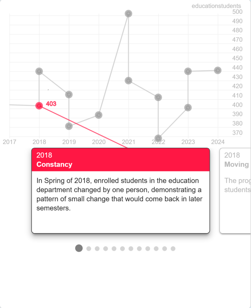
In this project, I sought to investigate the enrollment of students in the UMW education department and examine if/how the number of students changed as the teachers shortage evolved in the US. By examining this data, taken from the annual Grade Distribution Report from UMW’s Institutional Analysis and Effectiveness department, I found a story surrounding curriculum education at UMW that was much different than I expected. Although the number of students enrolled in education classes was not the highest out of the departments at UMW, it was not the lowest either. In fact, the department did not only decrease in the number of students enrolled in education classes, as I had deduced due to the national teachers shortage, but had rather increased or remained stable as a whole. While COVID caused the loss of data for the Spring 2020 and smaller numbers in the Fall 2020 semester, the department was able to recover from COVID, initially growing in the number of students enrolled and eventually leveling off to stable enrollment numbers higher than the Fall 2017 students the data set began with. For more information, check out this Excel Sheet with the data on the number of education students each semester.
What Does This Mean?
While the nation faces a national teachers shortage, the number of students interested in entering the education field, while decreasing initially, has grown to stable, relatively high numbers of enrolled students. This proves that an interest in working in education field remains. Examining data sets and stories such as this one is so important because it allows federal, state, and local education officials to source the problems of the teachers shortage. This data set proves that there is not a decreasing interest in the education field, but rather other factors, such as poor working conditions and pay, that may be causing the teachers shortage. As the child of teachers, the importance of examining the causes and effects of the teachers shortage is important for keeping schools a safe space for learning for all children, with all the necessary resources for learning.
Software and Processes
To make this infographic, I used Excel to decipher the data and create a clean and effective table. This data was then imputed into a Google Sheets form that was used to create an infographic through Storyline’s system.
Credits and AI
AI was not used at all in the creation of this project. All media was created through the Excel or Storyline programs.
Final project idea
Build out main domain
For my final project, I want to build out my main domain. I used to be an artist, so I want my online identity to showcase that. I could add a few photos of my art I did and write about what materials I used and why I decided to create it. I had an art series I did on how time affects things so I could discuss that concept. I want my blog to be about my hobbies and what interests me, so I think that art would be the biggest factor and my biggest supply to show. For the project part, I could make another art piece, showcase it, and discuss how and why I created it.
Data-Driven Storytelling
Data-Driven Storytelling
My Infographic
The final infographic for project 9
What is My Story?
Identifying the story represented within my infographic
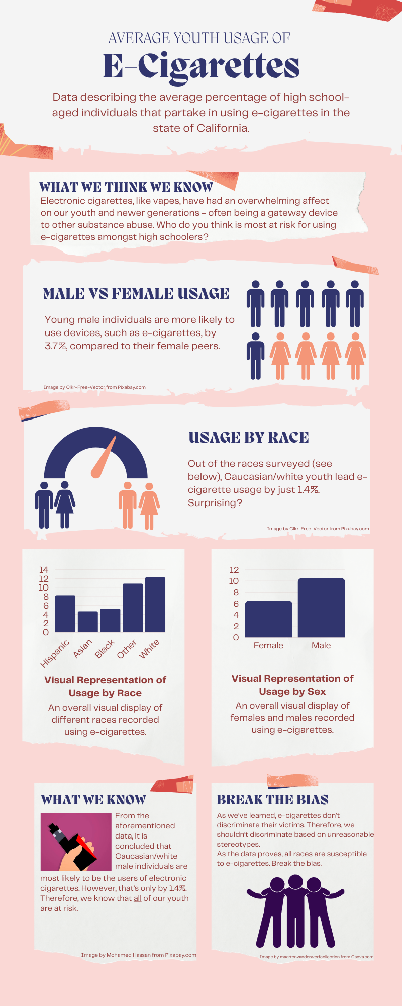
My data showcased ratios of electronic cigarette usage within high school-aged individuals located in California. The data I decided to isolate are race and sex based. I wished to have my data guide my story in the fact that we hold unreasonable stereotypes in many social situations. However, as a society, we hold “deviant” acts highly when considering these racial stereotypes. Therefore, I wanted my data and infographic to tell the story that, despite what we are told to believe by society, usage of e-cigarettes actually defy these ideals. In fact, it is white males that are most likely to partake in using electronic cigarettes. However, this is only by a small percentage. So, e-cigarettes (which are believed to be a gateway device to more dangerous substances) don’t discriminate, so neither should we when considering this. Thus, we need to break the bias.
To further inspect the data reflected in the infographic, you can visit the exact dataset I chose at Data.gov!
Why an Infographic?
Why I decided on an infographic to tell my story
I’ve made infographics for past classes, and I love the way they simply display data without missing any important aspects. Therefore, I felt that with my specific isolated components, that an infographic would perfectly display these elements, and leave myself room to pinpoint the story I wished to tell, and how the data related to the story.
How I Did It!
How I made the infographic and visual representations
I made the whole infographic using Canva.com, along with all of the data charts. However, although many of the images can be found directly from Canva’s website, many of the resources are actually rooted from Pixabay.com, and other free-source websites. Canva was very straight-forward to use, as many of the visuals were easy to drag, drop and move around. Additionally, I love using Canva for many projects, academically and otherwise, because Canva also produces all of the visual representations from the internet all in one place. However, as aforementioned, it’s always crucial to double-check where these images actually came from.
Attributions and Credits
Giving credit to all of the resources I used!


Image by maartenvanderwerfcollection from Canva.com
Data-Driven Story
My Audio Project: Field Hockey Injuries
The Podcast
Transcript
Sound of whistle blowing
Every game tells a story, not just through the goals scored but through the challenges players face on the field. Today, we dive into the data behind injuries in field hockey—a sport of speed, strategy, and skill.
Field Hockey game sounds
On the field, where injuries happen tells us a lot about the intensity and demands of the sport. In the women’s game, most injuries occur inside the circle—25 cases in our data. This area is where goals are scored and stakes are highest. Imagine the sound of sticks clashing and players diving to block shots.
More field hockey game sounds
For men, the risk rises even higher, with 95 injuries reported in the circle. The competitive pace and physicality of the game amplify the danger in these moments.
Sounds of footsteps running on turf
Injuries also spike near the 25-yard line. For men, 59 injuries were recorded here, compared to 17 for women. Midfield is quieter by comparison, with far fewer incidents. The game, it seems, demands the most in zones of intense offensive and defensive action.
Crowd Gasping
While these numbers highlight the risks, they also underline the resilience and strategy of the players. Every tackle, every sprint, every shot carries a calculated risk. Field hockey is not just a game; it’s a battle of endurance and courage.
Whistle Blows
The field is a stage where athletes push their limits, and every injury tells a story. This is the reality behind the game we love.
The Story
The data is based on where injuries occur the most on the field hockey field, both for men and women. The story outlines the intensity of the game in the sense that the areas of the field with the most action is where most injuries occur. The point of this story was to engage the audience with an emotional appeal as they feel the passion for the game, and understand the risks in the most intense areas.
Why a Podcast?
I chose a podcast so I could incorporate sound effects that reflect the intensity of the game. I wanted to challenge myself to be able to share a story through audio, which can be difficult to follow as a listener. The data for field hockey would be best reflected using sounds, or videos, however, I did not want to act out getting injured or risk anybody else.
The Process
I used Vocaroo to record my audios for the podcast. I recorded my script, then the sound effects. I then put all of the recordings into SoundTrap to edit. I pieced together the transcript, as well as the sound effects to give it a story tone.
Credit
I credit @nufhcats on Instagram for the sound effects of the team playing and cheering.
I credit Royalty Free Sounds for my other sound effects.
I credit Chat GPT for assistance on organizing my podcast.
Data-driven Storytelling
Information used
The information that I used was the information that we had to find last week for the project. The information that I found last week was the number of undergraduate students enrolled at UMW as of December 2023. I took the programs with the highest and lowest number of students enrolled. This information was obtained from the University of Mary Washington website.

Information presentation
I chose to do a short video. There are many occasions that when you are attempting to share data it can be BORING!! I know that I personally have had to sit through meetings or presentations that during that time all you could think is…this could have been an email. I chose an option that with images and “ear catching” background music would keep the attention of the viewer.
How it was made
Although I did not use video footage, I did use photographs, still images, and factual information sheet within the presentation to show the information I was trying to share. The video was made in Microsoft Clipchamp. I believe, for me at least, that is the easiest format to use to create and share your video creations.
Presentation
Credit for informatio used
Images of the University of Mary Washington
Cereal Data!
Do you have a favorite cereal? I don’t have cereal often but when I do it’s usually because I have a random weird craving to have it for dinner like my mom used to let me do occasionally; perhaps it’s a craving for that familiarity of a fond childhood memory. Either way, I know one thing about cereal: their nutrition facts are all over the place (maybe that’s just all processed and packaged American food? That’s for another blog post entirely). Anyways.
I Zeroed in on Fiber and Potassium
I found this dataset of 80 cereals, cleaned it up, and I took a look at it to see if there were any significant comparable numbers and trends. I looked at each aspect of the nutrition label including sugar, fiber, sodium, fat, calories, and vitamins, but what I found was that a strong positive correlation exists between fiber and potassium, indicating that cereals high in fiber are also likely to be high in potassium! I went further as to see which manufacturers cereals average the highest fiber and potassium content, and I found that it was Nabisco! Those are the people that make Oreo’s and Nilla Wafers (who knew they also made cereal? Not me). This was compared to Quaker Oats, Post, Kelloggs, and General Mills (I took out the American Home Food Products data).
The blue bars in my chart represent fiber content. I know my chart is sad (at best), but if you look closely (yikes), in the Nabisco section, you can actually see the blue bars compared to in the other manufacturer sections where it barely exists.
An Infographic?
I actually switched around what I was going to do at least four times. I had no idea how I was going to go about it and ultimately, a long vertical infographic popped into my head and it made sense to me. Now, I wrote the text first before editing the layout of the infographic and I fear it sounds very sales-y, commerciall-y, market-y, but that’s just what I’m used to! I tried, OKAY! I like to think of it as ~informative~. I figured there are a lot of people who don’t like to be told about what’s in the food they’re eating (trust me, I would know), and this is a playful, calm way to go about it. That’s another reason I just chose to identify and report on a trend rather than identify a trend and then use my media portion to be like, “Cereal has so much sugar! It’s gonna give you diabetes!” You know?
Canva A.K.A. my Bae
Canva is actually the love of my life and she executed my vision for this infographic perfectly. Included my chart, visuals of cereal bowls and other supporting icons, an icon with the correlation of the potassium and fiber link, and the Nabisco logo. I broke up the text into small, digestible chunks, getting straight to the point with each, but also making fun, engaging titles to grab attention (you have to be fun when the topic is cereal). I used Canva on my Chromebook!
Attribution
All of the icons are from within the Canva platform with the exception of the Nabisco logo which I got from a simple Google search and of course the chart I made on Microsoft Excel. Canva has so many cute icons. Don’t play with her! All of my nutrition based facts and tips are from the CDC.
In Another Life
In another life where I actually like looking at numbers and I desire to get better at making charts and stuff of the sort in Excel, I would have added a scatter plot highlighting the higher numbers in Nabisco cereals. I also would have made a chart where it just shows the average fiber and potassium content of each manufacturer instead of the content for multiple cereals, that way it’d be less cluttered. I think the use of small little bowl and spoon icons on a chart or scatter plot would be cute and simple too.

Now go, and eat thy cereal!
Final Project Idea

Mix of two?
For my final project, I want to create a subdomain for my cats. I would like to use option 2 to create a website to continue my cat’s Instagram page. This also could be option 3 because there isn’t specific project I want to do like a podcast or such. I am interested in expanding my page for the cats including photos, videos, articles, and updates, similar to a blog.