I chose two images that I had previously used, I think. This time however, I have changed them to SVG files. When you are putting images into a blog post or onto a website you are enabling the person or persons that is looking at your site or reading your thoughts to understand what you may be seeing or trying to convey at the time. You could try to describe an image in a hundred different ways but never really get someone to see it as you see it.
I chose to use Vectr (https://vectr.com) to create my image. I attempted to use some of the others discussed in class but for someone who has never created any type of digital imagery other than just inserting a photograph that I have taken onto social media, this was the easiest for me. I felt that it was to most user friendly to navigate through so that I was able to achieve the desired result at the end. I did not however feel that it was the most user friendly with WordPress. This could be completely a user issue though.
I created this logo in order to fully encapsulate how I am as a person, as well as I how I want to portray myself on my website. My favorite colors are pink and green, so I knew I wanted to incorporate those. My favorite season is spring, as it is a time for growth, and the flowers and leaves start to come back, so I put one of my favorite flowers right in the center of my logo. With my heading image, I wanted to incorporate everything that I love as well in it. The phrase “‘Liv’ing My Life to the Fullest”, is a play on my nickname “Liv”. Also, it shows what my goal with this website is, which is to show my projects and to show what I am doing in life.
The Process and File Types
I used Vector to make both of my images. The process I found to be easy, as I had total creative freedom with whatever shapes, colors, or images I could use. The process got a bit harder once I had to figure out what colors would fit, as well as the image and how it would look with the colors. Also, the font would have to fit the aesthetic of the image. I found the flower and natural images on the ‘Elements’ tab on Vector. I thought it was cool how we could look up just key words like “nature” or “flower”, and hundreds of images are free to use. Overall, I thought Vector was an easy site to use, and it made the process of creating a logo a little less daunting. I used JPEG to download my images to the website. I chose this one since it of one of most common image file formats. To read more on why Vector is a good website for creating images, visit Core IDRAW for more information.
Image made my okern on vectr.comImage made my okern on vectr.com
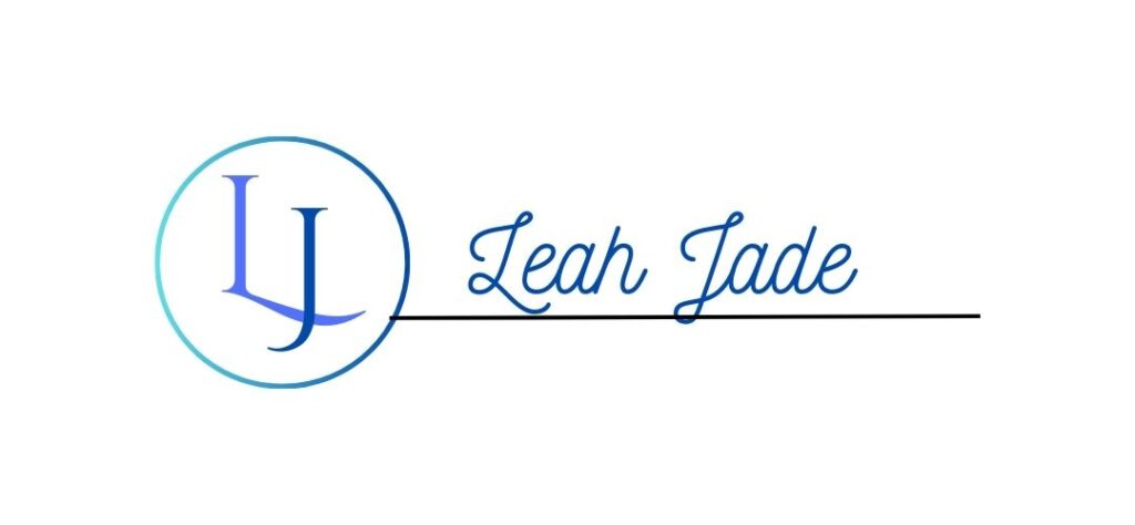
Website images can be a powerful way to convey the owner’s purpose, intent, and mood. I chose simple designs that make use of my initials and my name, which makes sense since my website address is my name. Also, by excluding a photo or another graphic, I will be less likely to want to change or update the design in a few months.
Digital Image Design
I used Canva to create both my favicon and header image. I chose this software because I have experience with it, and also because it is a vector-based editor. I knew that this would work best for this assignment because it allows exports in different resolutions. I exported all images as JPEGs so they could be easily uploaded to WordPress.
A website icon is a picture, graphic or design which helps users to have better experience as they browse, and interact with the web page. It helps users to identify websites easily.
I choose this image Big B and K with stars. Because images are powerful in a way that they not only attract our attention, but also when the eyes spot them faster they catch our attention. An image influences decision-making processes and prompts actions such as purchases and social shares. The colors, shapes of images convey messages much quicker than a block of words. Images and media attract and engage our attention.
You can use art and design software programs that create an image directly on a computer, like Vectr or Canva and other resources from the web. I used the Canva design web page, which also helps beginners to create sketches and digital art for free. Click here to use Canva to create your own logo.
Why I chose the file type for these images
The reason I chose the PNG file type is because it has more detail and a higher quality than others, such as JPG. Some of other image files take up more space than others which will affect your site load time. Some image formats can be larger or smaller without losing quality of your work.
As discussed in my first post, I love to create! Some of my earliest memories consist of painting welcome home banners with my mom and brother for my dad when he’d come home from deployments, painting pumpkins, and making Christmas cookies with my mom.
If I could pinpoint a time that really got the ball rolling on my exploration of creation in my “adult” life (besides being in choir all of middle school), it would be taking pictures for the photography club that I wasn’t even in my 8th grade year. That club advisor went on to choose my art for our school yearbook cover that year (you know my 12 year old self was SICED).
Ever since then, I’ve not only enjoyed exploring things like photography, graphic design, drawing, modeling, event planning, content/video creation and fashion, but sharing these things with others in addition to learning from others that are more advanced in these areas.
Now. Despite my thorough exploration of digital creation, there is ALWAYS more to learn! So I am going to summarize some things that have been a review for me recently along with new things I’ve learned.
All the Things
If you are a human in 2024, you have likely heard of ‘pixels,’ or the smallest units of a digital image. Pixels, (short for “picture elements”) are tiny dots that combine to form an image, akin to atoms in a physical object. Each pixel can display a different color, and a higher number of pixels enhances image detail.
Resolution refers to the image’s level of detail, defined by the total number of pixels, expressed in width x height format. For example, “100×100 resolution” means the image is 100 pixels wide and 100 pixels tall, while “1920×1080 resolution” signifies an image that is 1,920 pixels wide and 1,080 pixels tall. More pixels contribute to a clearer and more detailed image.
There is so much more to know about graphics like rastor graphics (the photos on your phone) and vector graphics (your favorite brands logo), but I won’t get into the nitty gritty- just know there’s a world of knowledge about graphics!
Info drawn from Professor Cartland’s Canvas page!
My Site Graphics
I got to make two graphics for my site, and I’ll be so honest, my professor is probably going to tell me I have to go back and do them on different software or that they’re resolution is off, but that’s a problem for future me (I’m still learning-everything is FINE).
My Favicon
First of all, favicon is the best word I’ve ever heard. Second, it’s that lil logo you see on the tab at the top of your screen. Mine is a little heart connected to an upside down heart that I drew forever ago. For as long as I can remember, I’ve always signed these hearts with my name, and a couple years ago, my parents and I got it tattooed. I made this JPEG graphic on Vectr, using 512 x 512 pixels as it is the recommended sizing by WordPress for favicons. I wanted the background to be transparent, but I couldn’t figure out how to do it in Vectr, so I gave up.
My signature doodle, tattoo, and now favicon.
My header
I also created a header for my website! I am a Canva girly at heart, so I created a PNG vision board using all photos that I took in my camera roll- after all, my whole thing is about ‘loving yours,’ so I wanted it to be all of the moments in my life that I am grateful for. Friends, coffee, food, fitness, and family. I included a few quotes from Pinterest to which I’ll link their original home on the web. The WordPress theme that I have my website set to right now has a header of 1300 x 500 pixels, and the closest pixel sizing that Canva has is 1500 x 500, so I had to crop a little in WordPress, but that’s okay.
Picture drawn by Coni Vigna. This work is licensed under CC BY-SA
My favicon is a hand slapping emoji. It is a reference to a fictional website called “The Slap” which is used as a blog site on the show Victorious. Victorious takes place in the same universe as iCarly, which my website is named after. I thought this was a cheeky homage to both shows and it didn’t take too much skill to draw which was helpful because I have never seriously drawn on a computer before.
Picture drawn by Coni Vigna. This work is licensed under CC BY-SA
My header image is based on my personal motto: “You can’t spell iconic without Coni.” I’m not the most talented artist, so I found it was easier to make the header mainly text based, but the colors and design reflect my girly personality well. I decided to use that header as opposed to something else because I couldn’t find a specific image that represented me. Even if I could, I was struggling to find an idea that took up all the space. That was how I landed on my slogan. It’s cute and there’s no awkward, empty spaces.
The Process
I found the process for this project to be extremely challenging. I was originally going to use Vectr to make my images, but I found that website to be way too difficult to invest my time into, especially when I’m paying for Adobe Illustrator. I knew there would be more tutorials and help for Adobe and since I pay for it, I know I’ll continue to use it in the future, so that was the software I used. However, Adobe was also very frustrating to work. I think it’s good that this project made me finally sit down and figure it out, but in the moment it was terrible. I’m happy now, that I have a better understanding of it, although there are still things that confuse me, and things that I think are harder than they need to be. The favicon was made mostly with the pencil tool. I used it to make the hand and the yellow “slap” lines around it. Those were both made in 2 separate layers and then a third that I used to color the background all white. For the header, I used the pencil to make the pink squiggly frame, but the brush was used for the majority of the art. I freehanded the writing and the hearts.
File Types
Both the files were downloaded as PNGs. I know from my experience with using Canva, that PNGs are better for detailed and more high quality work (although, I don’t know if anyone can call this work high quality.)
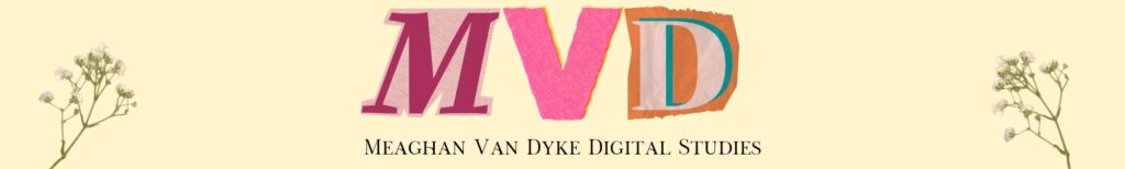
The favicon for this website includes my initials “M” and “V” cut out “scrapbook-style” with a pressed flower behind the two letters. I chose this design because the cut-out, scrapbook look of the letters represents the variety of different media and content-types posted on this website, while still giving it a more personal touch with the pressed flowers. The mark of a perfect favicon includes a memorable design that gives website users an idea of the person behind the website. These were important factors for me to consider while designing my favicon.
How Was It Made?
I created this favicon using Canva. As someone who uses Canva almost daily to design media for the Fine Print Club (an on-campus club I am the proud co-president of), I am very familiar with the tools in Canva and the elements that could be used to personalize the design. First, I chose the color of the favicon’s background, and then used the elements feature on Canva’s website to add the initials, text, and pressed flowers image. I did not use a pre-made template to create this, but rather personalized the ratio of the piece and started blank.
File Type
This favicon is a 512×512 px JPEG, the type of file suggested by the WordPress theme. This JPEG is also a raster graphic, with each individual pixel containing its own color.
I created this header to match the favicon of the site as closely as possible. Therefore, I used the same color background, the same color and style of initials, and the pressed flowers in each corner. The only noticeable difference is the pixilation and the “Meaghan Van Dyke Digital Studies” at the bottom. This was added to include the name of the actual site itself in the header.
How Was This Created?
The header, like the favicon, was created using Canva. I chose Canva for both file creations because of my familiarity with the format and the variety of customization options. Similarly to the favicon, I chose the color of the background first, and then layered the initials, subheading, and pressed flowers on top.
File Type
This header is a 2000x300px JPEG file, with the pixilation chosen at the recommendation of the WordPress theme. Since this file is a JPEG, it is a raster graphic.
For my blog banner, I wanted something simple that represented me. In the future, I want my blog to be space where I talk about music, pop culture and share photos. I think these three icons feature what I want my blog to become. For my favicon, I wanted my initials to be incorporated somehow with a simple background. I did black letters for a high contrast against the white background.
The process and software
I made my favicon first, on Canva initially. They have easy, pre-made designs that I customized to fit my aesthetic. I put it on Vectr so I could download the picture with a high resolution. Then on Vectr, I created my banner. I had a hard time trying to get other designs to fit properly. So I opted to do a simple three icon design that fits what I will put on this website. Vectr has simple irons to choose from, so I just picked some of those to add to my banner.
What file types
For my favicon, I initially downloaded it on Canva as a PNG, and then went to Vectr to download it as a JPEG. For my banner, since I created it on Vectr, I downloaded it originally as a JPEG. The reason I chose to download them as I did was because that was how the website recommended. Vectr doesn’t let you choose a different file type without buying the premium version.
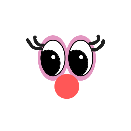
There are two separate images I chose for this project. The first one is a googly eyed face. I didn’t want anything too serious as that would not best represent me. This image was created using the white board on Canva. There were different shapes and pen sizes to choose from. I call this ‘looking for inspiration’ because the creature is all eyes and ready to observe. I am a carefree and semi goofy person once you get to know me, so I created this to represent the not-so-serious-side of Danaja that not many people get to know.
Creator: Danaja
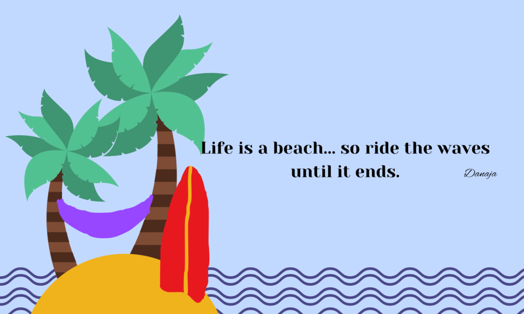
The next image I used is an image of my own. I love this image because it reminds me of my favorite past time, Chillaxin’ (chilling out and relaxing). This icon consists of two palm trees holding up a hammock. The surfboard is a reminder to try your best to surf through life. With all the ups and downs, do your best not to get dragged out to sea. Although I am not the best artist, I hope that I conveyed the message of vacationing. I made this icon using the white board on Canva as well along with the help of a template. Both of the files I used are PNG files. PNG stands for Portable Network Graphic. I used PNG files because they have a brighter and broader color palette to work with. The more colors, the more options you have to get it as close to what you imagine.
Created by KelseyAnne Coleman, Background Image from Vectorpea
Logo
Created by KelseyAnne Coleman
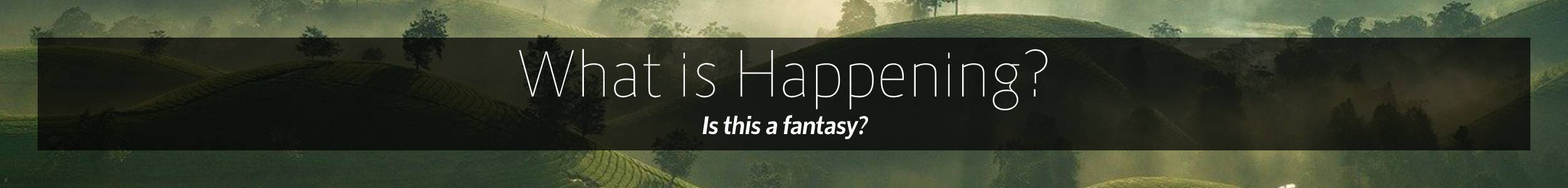
The images above are the header and logo for my site. I decided on them because the first try of making them didn’t work well so I tried with different images. The header image was chosen because I liked the way it looked. And the logo design I thought would show up will. I am not very creative, but I used Vectorpea to choose the header and Canva to make the logo.
The background image of the hills in my header image was suggested when I put in the pixel size. The image had the words “Hello World!” and “What a beautiful day.” in the center of the image. I changed “Hello World!” to “What is happening?” and kept it in the center of the image. I changed “What a beautiful day” to “Is this fantasy?” because I liked it and thought it with well with “What is happening?” and the name of my site “KelseyAnne’s Thoughts”.
The logo image was made from a template that someone made on Canva that was available for public use. The template was made by @syammasfitria, links to original design. I liked it but I needed to change the initials to match my site, it also had words below the initials that I got rid of. I used “K” and “T” because they represent the title of my site. You can see the initials on the site logo when it is on the tab.
I chose to download the header as .JPG because that was the most familiar type of file to me. The article from CRO:NYX suggests that it is the most recommended file type for images in a website. The logo was downloaded as a PNG because that was the default to download on Canva. PNG was also recommended for icons which is what my logo is. I also think that the other file types suggested in The Ultimate Guide to Website Images [2023] didn’t seem like they would be the right fit for what I was going to do with the image.