Images

Here I discuss how I learned to create different types of images and applied them to my page.

Creating a Favicon

Graphic design of a white radish. Grey with dark grey accent lines and bright green leaf sprouts.
by Rob Hatch, created in Affinity.

I set out to create a unique site icon know as a “favicon”, its a small symbol that is seen next to the name of the website on the tabs of your browser. I created the image above with the Affinity graphic design software. It took some time to learn, but it functions similarly to most Microsoft programs. If you have used PowerPoint or any other program that allows you to crop, edit, or draw over an image, you’ll be familiar. Before I started to draw anything I created a new square canvas with an aspect ration of 1:1. I chose the 1000-pixel grid and manually adjusted the page height and width to 512px X 512px, this is important or it wont work as a favicon. To make the shape of the radish I used the “Heart Tool” to drag and manipulate the heart until it resembled the classic elongated carrot/radish shape. I used the “Path Brush Tool” to draw on the horizontal accent lines and adjusting the width and color of the stroke. Once the lines were drawn, I used the “Stroke Width Tool” to create the uneven taper for the lines. For the sprouts, I used the Path Brush tool again but this time I only drew a few lines at the top of the sprout. It didn’t look like a leaf until I used the “Blend Tool” to replicate and connect the lines to form the leafy sprouts. When I was finished, I exported the image as a .png file, since this is the recommended file type for a favicon. The software that I used can be downloaded for free here: Affinity Download page.

Header Image

A bushel of white radishes.
Photo by Blowing Puffer Fish, posted on flickr.

This turned out to be more difficult than I thought it would be, in fact I had to use my “phone a friend” life line. Finding and altering the image was easy enough, I found it on flickr then uploaded it to Canva digital design webpage and applied a filter to increase the color contrast. Now comes the part that tripped me up, editing and creating a custom theme that allows for a banner photo. Once you have entered the editing portion of your WordPress page, on the tool bar on the left of the screen select appearance and then themes. If you have an active theme already, select customize at the bottom of the page. You will be brought to a page that allows you to make edits to your current page, a new set of options will appear on the left, select patterns. It will display a bunch of premade patters (most you have to pay for) but on the left there is a section for headers, that will present you a few options. Pick one that has a header image already. It will open a new editing page, click on the image, then the top tool bar select replace to either upload or open from your media library. I made sure to save my image as a .jpg as WordPress recommends. Now your photo should be in the banner, you can adjust the image focus and width of the header from there. Once saved, check to make sure that this header is displayed throughout your whole page.

Creating Blog Images

My Favicon

Pennant with initials AC
Created by Abbey Crumley in Affinity

When creating my website icon, I wanted it to feel somewhat outdoorsy and fun. This is why I settled on a pennant design with outdoorsy themed colors. I made this icon using Affinity using the shapes tool. I then added my initials, AC, and used a warp tool to stretch the letters to better fit the style and shape of the pennant. After some troubleshooting, I was able to save this design as a 512mm x 512mm PNG to make sure the photo keeps its resolution.

My Header

Abbey Crumley Digital Studies 101. Includes image of cat and Abbey outdoors.
Created by Abbey Crumley in Canva

After creating the icon for the website with Affinity, I realized I was struggling to use this program and switched over to Canva to design my header. When creating this header, I wanted to continue to highlight an outdoorsy aesthetic while showing who I am and the purpose of this website. This is why I used green text and elements throughout the design. I added the yellow stars to balance the yellow of the shirt I am wearing in the photo. The header is 1950mm x 500mm per the recommended size of the template I am using on my website. This additionally was downloaded as a PNG to prevent any blurriness.

Creating Images for my Site

Creating my Favicon

For my favicon, I used Affinity to create an image of a laptop with my initials on the screen on a berry colored background.  I used a laptop to signify digital studies.  I created it as a vector image so that I can make it any size I need in the future.  I exported it as a PNG because it is the best according to the guide Cartland gave us. I layered simple shapes in vector editing and used the text tool.

Graphic design of a laptop with the initials R and E on the screen
Image by Riley Evans

Creating my Banner

For the banner, I used Canva to create a raster image.  The header is a blue background with “Digital Studies 101” written in yellow.  For this, I used the background and text tools.  I exported the header as a PNG.  I chose this file type because it was the best suited according to the guide.  I am concerned, however, that my header is not the correct resolution and aspect ratio.

Blue bar with the text "Digital Studies 101" in the center
Image by Riley Evans

Creating Digital Images

Blue JN site logo
JN site icon. Created by John Nett in Affinity, 2026

My Two New Image Designs

For my project this week, I created two digital images for my website Surfing the Nett. For my first digital image, I created a site icon. I chose to go with something simple that stands out, my initials JN in a blue and turquoise water theme for the site, that not only matches the sites colors, but also is a play on the, “Surfing” part of the name.

Blue ocean waves and light blue sky, digitally drawn with paintbrush .
Ocean wave header. Created by John Nett in Affinity, 2026.

My new header image shows dark blue ocean waves against a blue sky background for my banner. This also connects to the surfing theme of my website. The banner gives a nice personal touch on the webpage and the new Icon makes the website feel less like an incomplete template, and more like a real site.

Creating My First Vector and Raster Art

As suggested I downloaded Affinity on my Mac to do both images, working with different tools for each image. For my site icon, I used the vector workspace, including tools like the rounded rectangle to create a more modern icon look. I used the text tool and the impact font for an easy to read text at 85pt. Additionally I used the style vintage to give the JN some pattern flair so it wasn’t just plain colors. I added 3d layering to the JN for pop and a gradient overlay for a special look.

For the header image, I used the Pixel workspace, painting the background sky blue, then finding colors that match my site for the waves. I wanted to keep the complexity minimal, I had added a stickman surfing the wave, but it didn’t communicate the right premium feel I wanted. Additionally I used the airbrush light pattern to give a sea foam look that added just the right amount of complexity I wanted before finally uploading both and publishing the new site.

File Formats & Image Types

I learned much about the differences in vector and raster artwork. Vector artwork like svg uses math and shapes to scale, whereas raster images use pixel grids that can get pixelated when enlarged. Both my images were exported as PNG files. The new site icon is 512 x 512 pixels and the header was the recommended 1800 x 300 pixel size. I chose to use PNG for the lossless compression and transparency. I will continue to keep in mind load times of the site for future added images or changes. Overall I honestly had never done anything like this and learned a lot about Affinity and digital artwork.

Creating My Cozy Brand Images

My Favicon

For my site icon, I made a hand-drawn scalloped crest with a classic serif letter “G” right in the center. I went with this look because I wanted a custom logo that fits a cozy, low-contrast style for my website. I used Affinity Designer to draw it, and I used the vector pencil tool with a custom pressure graph to get the look I wanted. By shaping the pressure line into a pyramid, it pinched the ends of my lines into thin needle points, which gave it an authentic calligraphic ink look. When I downloaded my site icon, I made sure it was a PNG so the thin cream lines and details would stay completely crisp and sharp instead of getting blurry like a JPEG.

Cream hand-drawn flower and sage green background
Custom digital favicon artwork created by Geneva Dickerson

My Header Image

When making my header, I wanted a simple but bold design that would complement my favicon. I used Canva to put it together and found the size and position tools super helpful for getting everything lined up. I found a vintage block-print flower graphic and sized the width of the piece to exactly 960 pixels inside a wide 1920 x 1080 canvas. I duplicated it so exactly two large graphics fit perfectly edge-to-edge across the top and bottom borders (960px × 2 = 1920px). This keeps the pattern looking clean and leaves the middle flat sage green space totally open so my site text is easy to read. I downloaded it as a PNG to keep the custom cream lines crisp when it uploaded to WordPress.

Sage green background with cream floral borders
Widescreen header graphic layout assembled by Geneva Dickerson using Canva

Logo and heading.

Affinity created images

A blue slanted capitol F
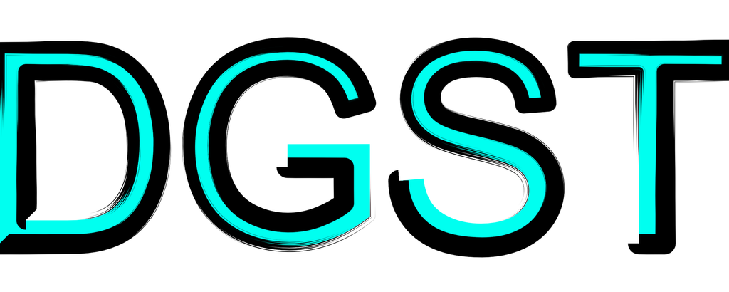
A D,G,S,T all capitol, colored in blue and black.

These 2 images are my heading image and my site icon, they are pretty simple images because this is a simple website, the F for the site name, and the DGST for the sites purpose. I Chose the PNG file type for the images because it was an image type that WordPress can accept. i created these images in an app called Affinity

Image Creation

My Image Creation Process

I had a lot of fun in the image creation process of this module. My favicon is pretty abstract shape that looks like a combination of a bow, butterfly, star, and a heart. The only real goal was that it looked cute and girly. My header image is just a bunch of hearts in a row. Both of these images were made in Affinity under the vector and pixel sections respectively, and made practically exclusively with the shapes tool. Both images I also believe are PNG’s, which is recommended for logos and headers. I also didn’t want the images to lose information every time I edited them, like with a JPEG.

The Favicon and Header.

Abstract shape resembling a combination of a star, butterfly, heart, and bow in the colors purple, pink, and hot pink.
Created by Zander Spence in Affinity
Alternating rows of Pink-red hearts on a white background.
Created by Zander Spence in Affinty

Creation Tool

Affinity Studio

Images

Creating My Vector Image (Favicon)

In my site icon, I created an image of a flower in different shades of pink. I created this image because it can represent delicate and youthfulness, which is where I am in my life. I used Affinity by Canva and the Canva website to create my image, and I found it simple to use the shapes tool, along with the layering tool. When downloading my site icon image, I made sure to make it an appropriate size (512mm x 512mm) and I downloaded this image as a PNG file type to ensure the quality was efficient for this website.

Light pink background with a magenta colored and abstract square with a flower of different shades of pink inside
By Ava Hild

Creating My Header Image

When creating my header, I planned to keep a simple but effective design that includes my name, the purpose of this website, and complimentary designs to match the site icon. I used Affinity by Canva and the Canva website and found the pixel studio helpful when places my designs in the header. When downloading my header, I fixed the size to best fit the space (1920mm x 400mm) and I downloaded this image as a PNG file type because within the pixel studio in Affinity, at least for me, it would download as a blank document if I used any other file types.

black background with text in the middle that reads "The Work of Ava Hild," in light brown coloring. Surrounding the texts are beige and pink flowers. On the edges show abstract graphics that layer each other.
By Ava Hild

Software used and mentioned:

Canva Studio – Canva

Professional Creative Software | Craft In Affinity, Scale In Canva

Creating Images for My Website

For this project, I created two different images for my website using Affinity. The first image was a favicon, and the second image was a header image. For my favicon, I created a blue circle with my initials, FR, and a sine wave. I got inspiration from NASA because I like its simple science and space style. I made my own design in Affinity using the ellipse tool, text tool, and curve tool. I used blue, white, and black so the logo would be easy to see, even when it is small. For my second image, I created a header for my website. I made it by layering different shapes and graphics together in Affinity. I used blue waves, an atom, a coordinate sphere, mountains, and a sunset background because they connect to physics, science, and technology. I also adjusted the size and placement of each layer so the image would fit the header area correctly. I used PNG for the final images because it keeps the graphics clear and works well for websites. PNG also supports transparency, which was useful for my favicon because I did not want a white box around the logo. One difference I noticed between vector and raster images is that vector images are made from shapes and paths, so they can be resized without losing quality. Raster images are made from pixels, so their resolution matters more and they can become blurry if they are enlarged too much. This project helped me understand why choosing the correct image type, size, and format is important for web design.

Favicon

A blue circular logo with the initials FR in white and a black sine wave running through the design.
Original logo created by Fernando Reyes in Affinity

Header Image

header with blue waves, an atom, a coordinate sphere, mountains, and a sunset sky.
Original header created by Fernando Reyes in Affinity.

Digital Image Creation

What are my images, and why did I choose them?

My favicon is a fun piece I created in Affinity. It is a vector image. I created this to play with various tools in the app. I have used Adobe InDesign, Illustrator, and Photoshop in the past; it’s been a while, though. Affinity looks very similar to InDesign and Illustrator. Certainly looks very intentional by Canva. I created the header image in Canva. I used the spiral graphic to reflect the spiral used in the favicon image.

The Creation Process

For my favicon, I used Affinity and started with an A4 document in landscape orientation. I used the pen tool to make the scribble, made the line very wide, and chose black. Then I chose the Spiral tool on the Shapes menu to create the spiral, which I changed to pink. I wanted to add my initials, so I chose the Text tool and used the Bauhaus font. I used the QuickFX tab to add the Bevel/Emboss effect. I discovered my design size was incorrect after I exported the file. I went back to Affinity, resized the image to 512×512, and exported it again.

The header was created in Canva. I checked the required header size and set the design size from the beginning. I chose a spiral black-and-white graphic. I made the graphic smaller, copied and pasted it below, then copied the two pieces, made a set of four, and copied the set of four to fill the header. One thing I really like about Canva is that when you use a graphic like that, the edges match easily, so duplication is simple.

File Types Chosen and Why

I exported each image as a JPG because it was the required image type for the favicon and the header.

Link to Affinity

Link to Canva

Images created by Terri Crowder

css.php