Digital Image Creation

The Only Limitation is Your Imagination

As my mother and therapist would often tell me, I have quite the imagination! When i was younger, I could come up with the most imaginative stories of fairies in our garden or mid-night adventures with my invisible friend, Jack. To this day, I still enjoy escaping into my imagination and creating stories to tell my son who continuously begs me to publish a book with himi as the main character. But while my mind can take me to the fairy world and far beyond what others can only dream about, without art, or imagery, these worlds remain locked away in my mind. Because, you see, I am creative, but I am not artistic. That is a trait that my older brother and son somehow have, but that gene skipped over me completely. And while, most of the stuff that populates my brain on a regular basis is probably best left there, some of the creative ideas that I’ve come up with over the years has always longed to be experienced outside the constrains of my own imagination. I could write it out and describe how amazing these ideas and places were, and often did, but I feel like there was always something missing; they lacked depth and character – they lacked imagery. Now, with the dawn of AI, I am finally able to make these fantasies come alive!

smiling young girl wearing glasses flies out of her bedroom window into a beautiful, sunny garden accompanied by her fairy friends
Image created with Copilot; designed by me, KF

A Picture Really is Worth A Thousand Words

Just as my stories of garden fairies and trips to a hidden CandyLand in the clouds needed imagery to come to life, so, too, do the ideas expressed on a website. Pictures give depth and meaning to the words we express and as such, should accurately and clearly relate to the messages we are trying to portray.

For my domain, I chose to use a photo editing app on Android that I have been using since it’s inception nearly two decades ago. It’s called PicsArt and while there is a desktop version for the computer, I primarily use it on my Samsung Galaxy smartphone because I’m more familiar with using it there. PicsArt, like the rest of technology, has come a long way since the early 2000’s, and now offers AI enhancements to photos and AI generated images which is what I used to create the logo and icon for this subdomain of my website. I entered in the text “colourful brain and book representing neurodiversity” into the text field and PicsArt came up with several options which I then picked 2 and tweaked to better fit what I wanted to see. The result was the following two pictures:
two pictures, one of an open book with a brain sitting on it with a clipart heart in front and the text "My Beautiful, Messy Mind" above the book, and "Living and Learning with Neurodiversity" below the book; the other picture is of a colourful clipart brain with the text "my beautiful, messy mind' transposed over it.
two images created by Kfrisbee using Picsart for Android

However, after speaking with Professor Cartland, I ended up reworking the main image on my landing page to better fit the space and making the favicon less crowded. These are the final images, both created and edited as png’s in Picsart. (Hope they work because this assignment is already late…)
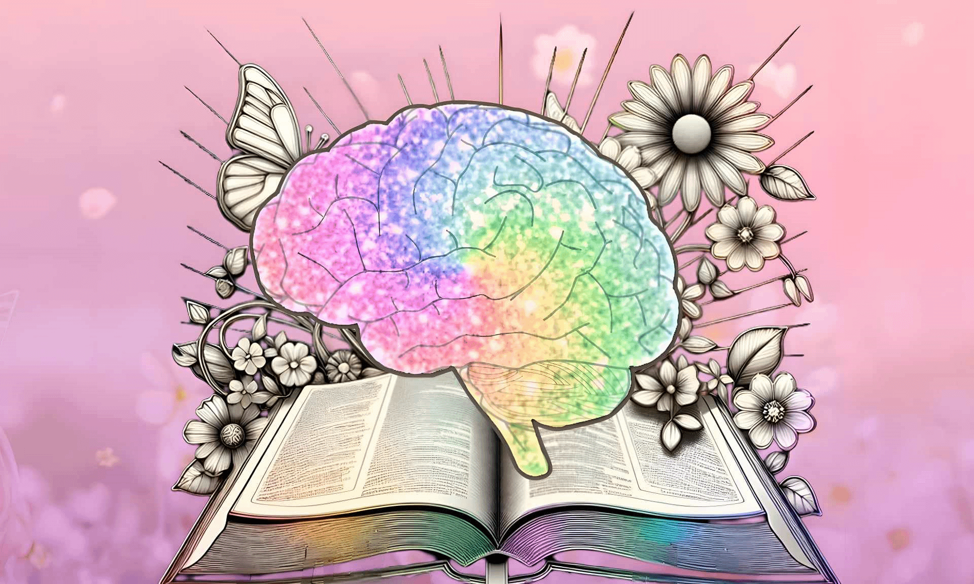
rainbow coloured clipart style brain transposed over an open book surrounded by flowers and butterfly that are colourless
created by me, Kfrisbee using PicsArt for Android
open book with a brain sitting on it with a clipart heart in front
created by kfrisbee using PicsArt for Android

I created these images to illustrate the message that neurodiversity should be celebrated as beautiful and unique; that my brain is beautiful and so is yours too; and I can still make beautiful things come from the messiness of my mind. And I hope there’s a message of hope to be found there.

Creating digital art

My designs: what they are and how I created them

Choosing the design

For the favicon, the image I chose to use is a circle surrounding my initials. I wanted the website icon to be something ambiguous, so that I could continue to use the same icon if I choose to repurpose the website in the future, but attributable enough to me that it could be easily associated with my name.

An image of a circle containing the letters "L" and "F".
Favicon, image sourced from Lauren Foley

For the website header, the image I chose to use includes the name of my website, surrounded by different geometric elements. I chose to use a similar color scheme to the rest of my website, in order to create continuity. I chose to incorporate the geometric elements purely for the aesthetic value, although I also associate the geometric shapes with digital art and the internet, so there is some congruency there as well.

Image of an orange background containing the text "Lauren Goes Digital" and various geometric shapes
Website header, image sourced from Lauren Foley

Creating the design

I created both images using Vectr, which is a free graphics editor, although the use of some features requires purchase. I first set my project to the desired pixel dimensions, before adding in the various elements I wanted to include, while experimenting with different colors and effects.

Choosing a file type

The file type I chose to use was .png, because it displays graphic designs better than .jpg, its counterpart, which is better suited for photographs. This file type helped to make my images clearer and improve the resolution.

Images

Site Icon

I decided to use an arrow with the name of my blog because it is simple, but still tells the viewer what the website is. I created it on Canva because it was a website I have used before, and I was slightly familiar with it. I chose to make this a PNG because that is what Canva recommended as the best way to download it.

A blue arrow with white text inside that says "Rachel's Reflections"
Designed by Rachel Oestrike

Header

I wanted to also make the header simple, but something that was cute and reflected me. I love flowers so I decided to make a simple design with a tan background and white flowers across the middle. I also used Canva to create the header and it made it very simple. I was able to place the flowers where I wanted them and mess around with the spacing. I also downloaded this as a PNG.

An image with a tan background and 4 white flowers across the middle.
Designed by Rachel Oestrike

The “Thought” Behind My Website’s Images

Visually Considering My Favicon and Header Images

Why I chose the images that are in place of my site icon and heading for my website

Thought bubble with lines of a sunshine around it and the initials S.T. in the middle of the thought bubble.
Image by Summer Koontz from dgst101.summersthoughts.com

A noticeable difference from previous assignments is the theme of my website. Previously, my site consisted of pink elements. Of course, my website appears quite different now. Originally I made this change because I was unable to edit a site icon (favicon) with the first theme I had chosen. However, I’m quite happy with the change for different, unrelated reasons. This reason blossomed from the creation of my favicon. To explain, while I was brainstorming possibilities for my favicon in relation to my site’s name (“Summer’s Thoughts”), I found that a desperate color change was needed for my theme. To explain, my name was a major part of the correlation, I felt it was only right to add a sunshine somewhere in the favicon itself, thus the color yellow was also added. However, I didn’t wish to have an aggressive, neon yellow but rather a modern, light and breathable yellow that’s more appealing to the eye. Therefore, it was only convenient to make yellow the primary color, this way the website is cohesive throughout.

Considering this, I then created lines of a sunshine around a thought bubble for the favicon – quite literally illustrating “Summer’s Thoughts”. Creative? Probably not a whole lot, but the favicon compliments the contents of the website – and that’s the main goal. Sometimes less is more in these cases, thus to ensure that the message you’re trying to communicate doesn’t get lost. Take the favicon for WordPress itself for example. This same principle holds true in the image I created for the header of my website. Reflecting further, perhaps the concept of the header is slightly different from the favicon. I wanted to continue the idea that this website is my “thoughts”. However, I also wanted to communicate the concept that although this website contains my thoughts, it doesn’t mean that it’s “my way or the highway”. Furthermore, as someone who is an advocate for openness and collaboration on the internet, my website should be no exception. I want my website to be home for open and non-judgmental communication that allows all different thoughts, ideas, etc. Therefore, although this is “Summer’s Thoughts”, let’s now talk about them together! Thus, the header image was born. I continued the visual element of the thought bubble, but upgraded them to not only thoughts, but conversations with speech bubbles. However, since there wasn’t a lot of justification for adding a sunshine in this context, I instead displayed that same yellow color that appears in the favicon within the speech bubbles and computer screen to continue the “summery” idea. 

How My Images Were Born

The process for creating my favicon and header images

Computer displaying the words, "LET'S TALK" with speech bubbles surrounding the computer.
Image by Summer Koontz from dgst101.summersthoughts.com

Having taken ARTS 104 over the summer, I already had access and a little bit of practice with Adobe Photoshop and Illustrator. Therefore, I felt the most comfortable creating the favicon and header images there. Going a bit out of my comfort zone, I used Adobe Illustrator (usually I begin in Photoshop as it’s a bit more straightforward). However, I enjoyed this creative challenge. Although I’m not sure if it was the consensus to use real photographs, I wished to go with a more interpretative approach by sticking with illustrations instead. I felt using only illustrations allowed the idea of acceptance in not being perfect, therefore further allowing deeper and much more meaningful conversation to take place. In this case, starting with a few shapes in Adobe Illustrator allowed the idea to flourish. As aforementioned, there was a lot of little details I added throughout the two images that allowed them to be the way they are currently (and hopefully to Dr. Berge’s liking – fingers crossed!). According to Cronyxdigital.com, it is best to have all site icons be exported as a .png. This is due to the fact that PNG allows transparencies while having larger file sizes. Diversely, I exported the image for my header as a .jpg. As aforementioned, Cronyxdigital.com says that JPEG is best for websites because it is the lightest file type, which is important as it won’t slow down the website further. 

Images

My Images

For both of my images I tried to keep them more on the simple side so they didn’t appear too chaotic. For my site icon I created this swirl circle and put my initials in the middle. For my site header I used stars. I used Inkscape to create both of these images. When I first started making my images it seemed kind of intimidating but I think by the end I had a basic understanding of all the features. I saved both of my images as PNGs because they work the best for icons. They allow you to make bright colorful graphics to use as your icon and the file size isn’t reduced.

red background with pink stars
Created by Claire Quinn on Inkscape
Blue circle with the letters CQ in the middle
Created by Claire Quinn on Inkscape

Quick Guide to Digital Image Creation

Site Icon: What is it and Why?

computer with messaging bubble on the screen and silhouette of a head with a gear coming from top of computer.
Image by Erin Dutton using Vectr

I chose simplicity when creating my website icon. I want my icon to represent this Digital Studies project as a whole (the website). I learn concepts and it gets my gears turning in my head to then think creatively and submit a project. That’s why I used the head shape with a gear. That project usually always involves a blog post so that is why I used the message shape on the computer.

Site Header: What is it and Why?

technology background with shapes referencing digital studies, the web and types of devices.
Image by Erin Dutton using Vectr

When thinking about making a header I thought about the fact that my website is a small portion of a whole digital space. I really liked the background of the header because it represents the aspect of technology in space. I wanted to use the shapes again to represent things you would use and see when accessing the web.

Creation Process

I used the website Vectr to create my icon and header. In my opinion, it is not easy to use for beginners. Even referencing videos online, it was difficult navigating the features. I’m not sure if it is because it is the free version, so I don’t have access to better options to use. I utilized the shape and image options on the tool bar. I changed their sizes and moved it around on the background to make the layout appealing. I could not figure out how to change any colors or take the background out for the icon, but that is just more I need to learn!

Image File Types

WordPress does a great job listing the required resolution sizes for site icons and headers. For a website icon the recommended resolution is 512×512 pixels. For a website header the recommended resolution is 2000×1200 pixels. CRO:NYX Digital recommends using JPEG file types when inserting stock images on your website, so I followed their advice. I downloaded the site icon and header as JPEG files before publishing them on the website. WordPress also recommends exporting your image at 72 DPI (pixels per inch) for the best resolution.

Happy Learning!

Digital Image Creation

rear of an  orange Ford Mustang that is parked in a parking lot.

I chose two images that I had previously used, I think. This time however, I have changed them to SVG files. When you are putting images into a blog post or onto a website you are enabling the person or persons that is looking at your site or reading your thoughts to understand what you may be seeing or trying to convey at the time.  You could try to describe an image in a hundred different ways but never really get someone to see it as you see it. 

I chose to use Vectr (https://vectr.com) to create my image.  I attempted to use some of the others discussed in class but for someone who has never created any type of digital imagery other than just inserting a photograph that I have taken onto social media, this was the easiest for me.  I felt that it was to most user friendly to navigate through so that I was able to achieve the desired result at the end.  I did not however feel that it was the most user friendly with WordPress. This could be completely a user issue though. 

The Why Behind My Website Logo

Why this logo?

I created this logo in order to fully encapsulate how I am as a person, as well as I how I want to portray myself on my website. My favorite colors are pink and green, so I knew I wanted to incorporate those. My favorite season is spring, as it is a time for growth, and the flowers and leaves start to come back, so I put one of my favorite flowers right in the center of my logo. With my heading image, I wanted to incorporate everything that I love as well in it. The phrase “‘Liv’ing My Life to the Fullest”, is a play on my nickname “Liv”. Also, it shows what my goal with this website is, which is to show my projects and to show what I am doing in life.

The Process and File Types

I used Vector to make both of my images. The process I found to be easy, as I had total creative freedom with whatever shapes, colors, or images I could use. The process got a bit harder once I had to figure out what colors would fit, as well as the image and how it would look with the colors. Also, the font would have to fit the aesthetic of the image. I found the flower and natural images on the ‘Elements’ tab on Vector. I thought it was cool how we could look up just key words like “nature” or “flower”, and hundreds of images are free to use. Overall, I thought Vector was an easy site to use, and it made the process of creating a logo a little less daunting. I used JPEG to download my images to the website. I chose this one since it of one of most common image file formats. To read more on why Vector is a good website for creating images, visit Core IDRAW for more information.

A pink circle with yellow sun rays in it. A pink flower resting in the middle with the text "Liv's Life" below it.
Image made my okern on vectr.com
A green screen with green outlined florals and leaves embroidering the image. The text, "Living Life to the Fullest" in the middle, with several flowers surrounding it.
Image made my okern on vectr.com

Graphic Design

Digital Images

Website images can be a powerful way to convey the owner’s purpose, intent, and mood. I chose simple designs that make use of my initials and my name, which makes sense since my website address is my name. Also, by excluding a photo or another graphic, I will be less likely to want to change or update the design in a few months.

Digital Image Design

I used Canva to create both my favicon and header image. I chose this software because I have experience with it, and also because it is a vector-based editor. I knew that this would work best for this assignment because it allows exports in different resolutions. I exported all images as JPEGs so they could be easily uploaded to WordPress.

Leah’s Favicon:

This is a picture of my website's favicon. It depicts my initals, "LJ," both in different shades of blue.
Designed by Leah Nguyen, using Canva

Leah’s Website Header:

This is a picture of my website's header. It includes my logo, which consists of my initians, "LJ," indifferent shages of blue. Also, to the right of that it says "Leah Jade" also in blue.
Designed by Leah Nguyen, using Canva

Website icon

Icon

A website icon is a picture, graphic or design which helps users to have better experience as they browse, and interact with the web page. It helps users to identify websites easily.

A stylish letter B and K with stars and a written starbeth in the middle with gray background.
Starbeth.net site icon used under CC BY 4.0

Why I choose this images creation

I choose this image Big B and K with stars. Because images are powerful in a way that they not only attract our attention, but also when the eyes spot them faster they catch our attention. An image influences decision-making processes and prompts actions such as purchases and social shares. The colors, shapes of images convey messages much quicker than a block of words. Images and media attract and engage our attention.

A stylish letter A and K with  a written starbeth in the middle with gray background.
Starbeth.net site header icon used under CC BY 4.0

What software I used

You can use art and design software programs that create an image directly on a computer, like Vectr or Canva and other resources from the web. I used the Canva design web page, which also helps beginners to create sketches and digital art for free. Click here to use Canva to create your own logo.

Why I chose the file type for these images

The reason I chose the PNG file type is because it has more detail and a higher quality than others, such as JPG. Some of other image files take up more space than others which will affect your site load time. Some image formats can be larger or smaller without losing quality of your work.

css.php